Responsive layouts
Responsive design ensures that your design adjusts to different screen sizes, and is a critical part of modern web and app design
Last updated
Responsive design ensures that your design adjusts to different screen sizes, and is a critical part of modern web and app design
Last updated
Be familiar with Figma - know how its layout constraints work, fully understand auto layouts, understand the importance of nesting and element hierarchy, and know when to use Frames instead of Groups (hint: just about always).
Do not go any further until you have read , and have gone through the basic .
Here are the basic steps we'll be covering here to make your Figma design responsive with Buzzy:
Understand Figma and Buzzy best practices and key concepts
Plan your design's responsive behaviours and needs
Test your design in Figma - resize, reposition and adjust as needed
Ensure your design is working in Figma before moving on to Buzzy
Turn on Buzzy responsive mode for your screens
Adjust Buzzy responsive settings as needed - min/max, overflow clip, scroll, wrap
Publish, test and iterate in a browser
Working with Figma and Buzzy is not like hand-coding an interface - it's easier, but comes with some ground rules:
Neither Figma nor Buzzy currently support @media
or device queries, or breakpoints
One screen in Figma equals one app screen - you can't dynamically swap screens or views based on screen size or device type
Figma's auto layouts are very similar to CSS flex layouts
Figma's layout constraints (positioning, sizing etc) and auto layouts provide the basics of getting a design to behave responsively as the viewport (browser or device) resizes
Figma lets you define 'fixed' position elements for your screens, such as navigation bars that will remain permanently in view
Got it? Right, lets dive in.
Assuming you already have a Figma design ready, or are working on one, stop. Take a deep breath and consider it from a layout perspective.
Here's some questions to ask yourself:
What screen size have you designed at? Why?
What should happen for users on other screen sizes?
Does any part of a screen need to remain always in view?
Which part (or parts) of the design should scroll if content is longer than the container?
As the screen is resized (for instance, on different devices, or as a user rotates a device to horizontal), which elements should also get resized? Should they stop resizing after a particular point?
As the screen is resized, where should elements be anchored? Is that floating button meant to stay a consistent distance from the left, or should it align to the right edge?
Depending on your design, some of the answers to these questions will be self-evident. Others might not become apparent until you do some testing.
Figma's own layout constraints and settings get you a whole lot of responsive behaviours without leaving Figma. To get a quick idea of how your design resizes, just grab a corner of one of your screens in Figma, and drag it; as it resizes, what happens to your design elements?
Fix any issues using Figma’s layout controls in the right hand design panel — depending on the layer you select, adjust X and Y position and alignment, size and resizing options (for instance Fill
or Hug
for items in an auto layout).
Getting your Figma design behaving correctly in Figma itself is key to avoiding problems later. Only when this is done should you add Buzzy to the mix.
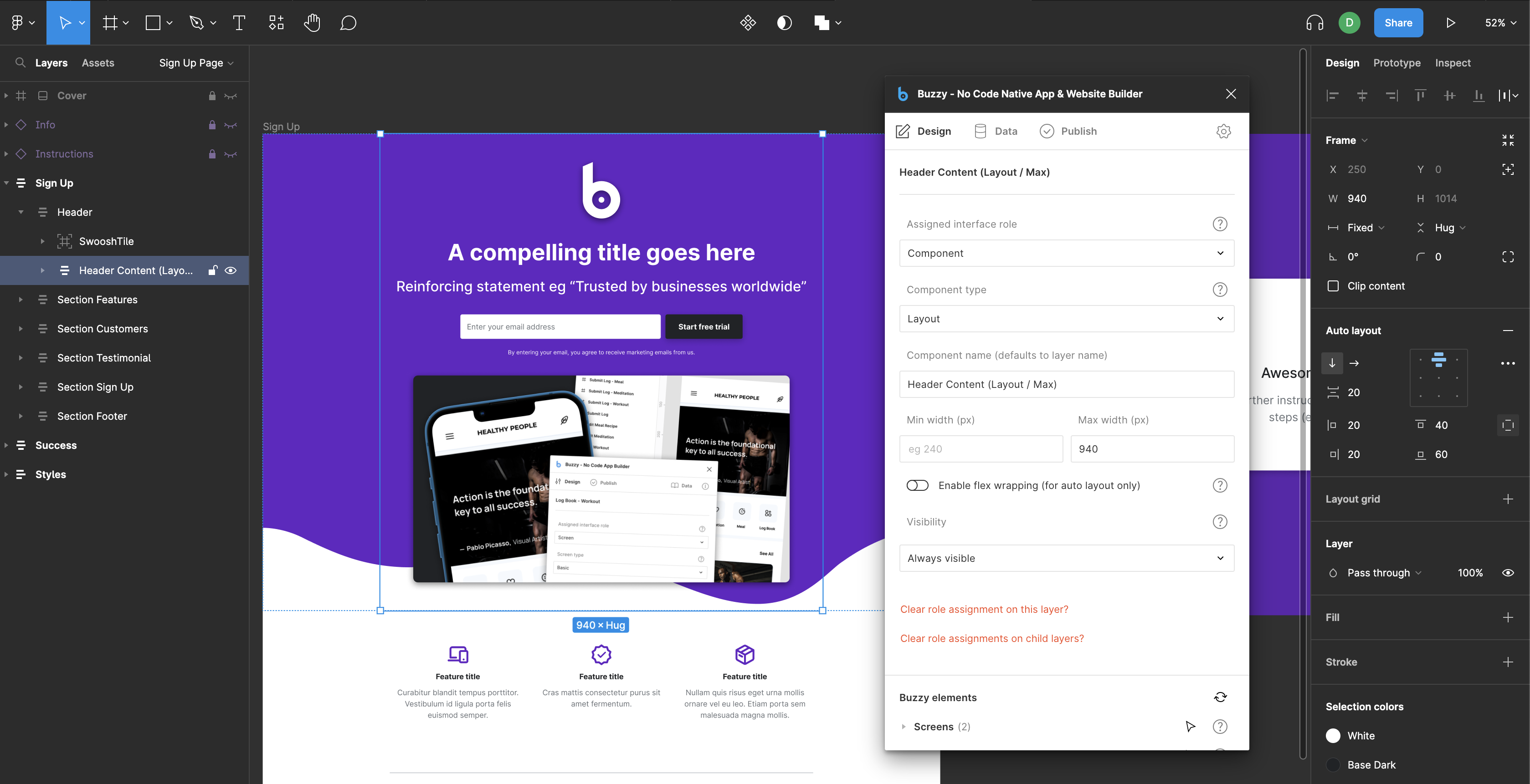
To make a Buzzy screen responsive, select the screen in Figma and turn on the 'Make screen responsive' toggle in the Buzzy plugin. This will also give you the option of setting a min- or max-width on the screen itself.
Defining a Figma element as a Buzzy 'Layout' component lets you set a min- or max-width just on that element. This means it will resize as needed (in the published app) until it hits the min or max limit - even if it has a fixed width in Figma.
NEW: Simply use Figma's own min- and max-width options to apply this - no need for a dedicated additional Buzzy wrapper.
In the example below, we want the screen itself and the purple background to be full width, and the content to resize - on small screens it will shrink to fit the viewport, on larger screens it will remain fixed at 940px.
Buzzy 'Layout' components also allow you to turn on flex wrapping - this is the equivalent of setting CSSflex-wrap: wrap;and means nested elements will wrap as needed. Note this only works with Figma 'auto layout' frames.
NEW: Simply use Figma's own wrap option to apply this - no need for a dedicated additional Buzzy wrapper.
In the example below, we want the 3 feature items to wrap as the viewport shrinks. Note that the other auto layout settings such as the center alignment of elements still applies.
Work through your design as needed and test as you go - publish your app with the Buzzy plugin, and test your key layouts and screens. Get the basics right in one spot before moving on to the next screen or section of your app.
Using the simple techniques above in combination, you can build up some fairly complex responsive designs, including forms that shift from horizontal to vertical layouts as needed.
Figma lets you define that Buzzy will use for your app
Buzzy adds handy additional layout options such as minimum and maximum widths
NEW: Buzzy now supports Figma's newly-released options you can apply to Figma autolayout frames. Simply apply these to your Figma design and Buzzy will render accordingly when published.
Because responsive design is such a tricky concept for novice users, Buzzy defaults to a 'static' layout for screens (meaning a screen is published as a container within the viewport with the exact same dimensions as the Figma frame). This is great for a quick demo or preview, but not for production. .
Buzzy supports overflow clipping and internal scrolling settings, including horizontal scrolls. You’ll need to define them on your Figma design using Figma's own settings, the same way you do for your Figma designs and prototypes. .
NEW: Buzzy now supports Figma's newly-released options. Simply apply these to your Figma design and Buzzy will render accordingly when published.
Most of the available in the Figma community are set up to be responsive. Here's some relevant ones:
Buzzy AI toolkit
The 'Examples' page includes a bunch of common page layouts and examples!
Responsive sign up page
The landing page example shown above; includes flex wrap and a resizing signup form.
Overlays, modals & alerts
Working examples showing how Buzzy handles a variety of overlay or modal elements.